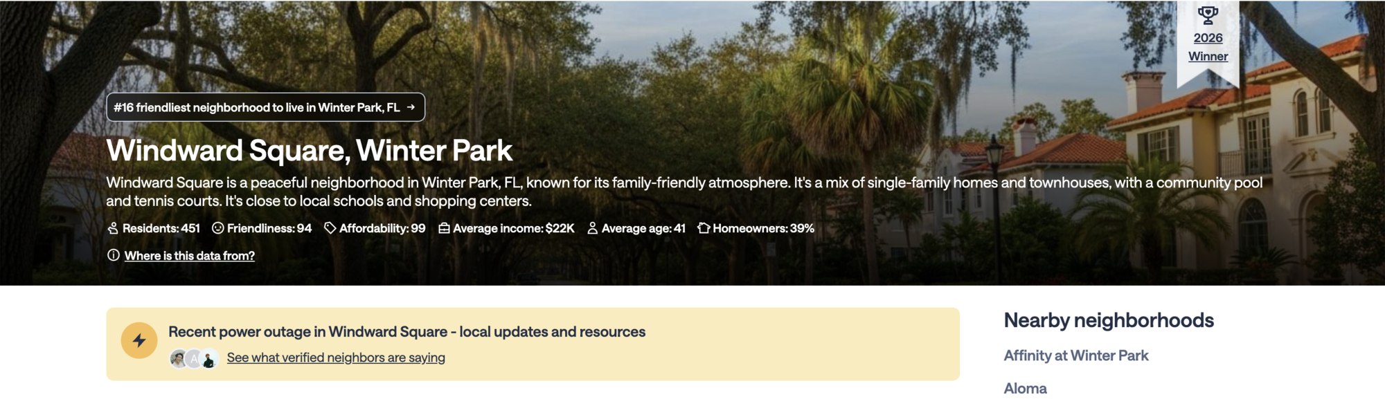
Non-members searching for local weather events and neighborhood updates were landing on Nextdoor SEO pages through organic search. When they arrived, the page gave them no signal that Nextdoor had what they were looking for and saw real-time, local updates from actual neighbors. So they left.
The north star metrics were registrations and good visits, meaning users staying longer than 35 seconds after arriving from search. The goal was to close the gap between search intent and the product's actual value, right on the landing page.
How do you turn a product feature into a conversion entry point without it feeling like an ad? I ran five sets of explorations, 4 to 6 directions each, narrowing to the top 3 before landing on the final design. The guiding principle throughout was to show real value, not a promise of it.
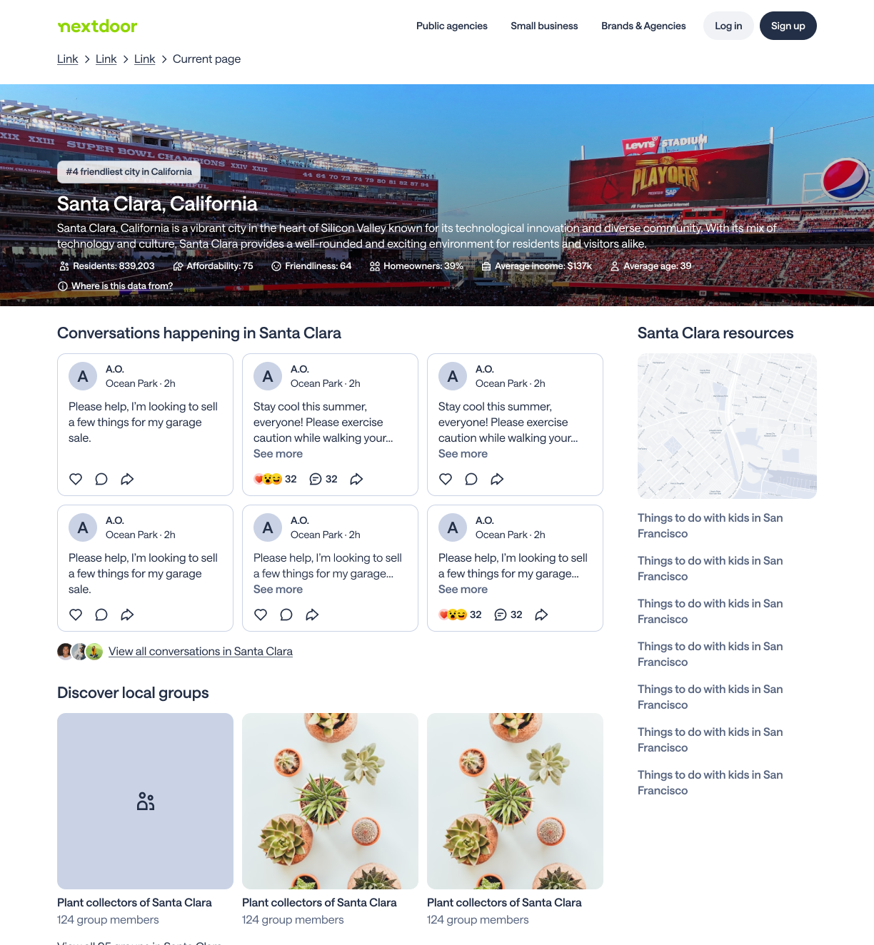
Borrowed from the Nextdoor product design language. Felt too product-like for an SEO surface trying to attract people who had never used Nextdoor.
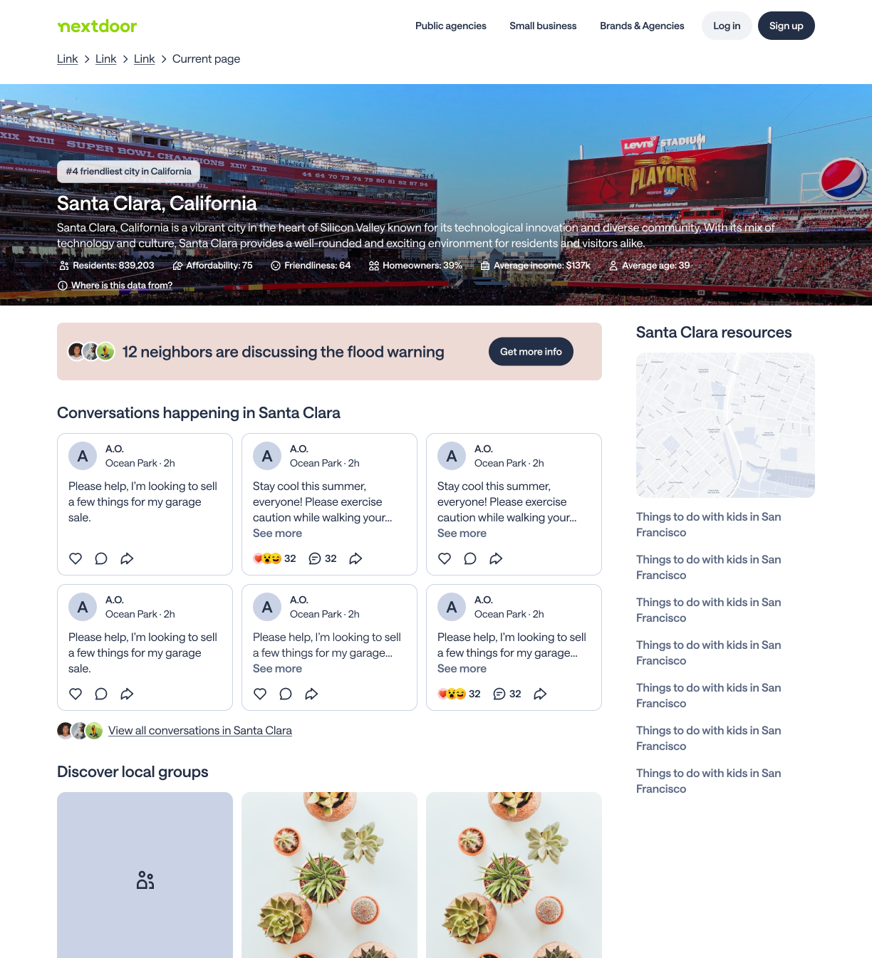
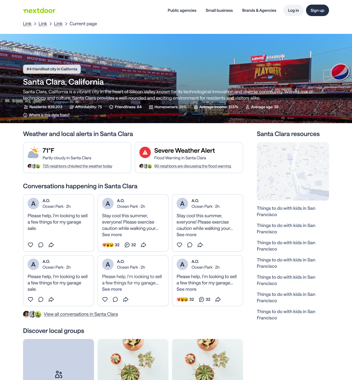
Treated the alert like a news article. Better for the SEO context but lacked the specificity and urgency needed to convert a non-member.
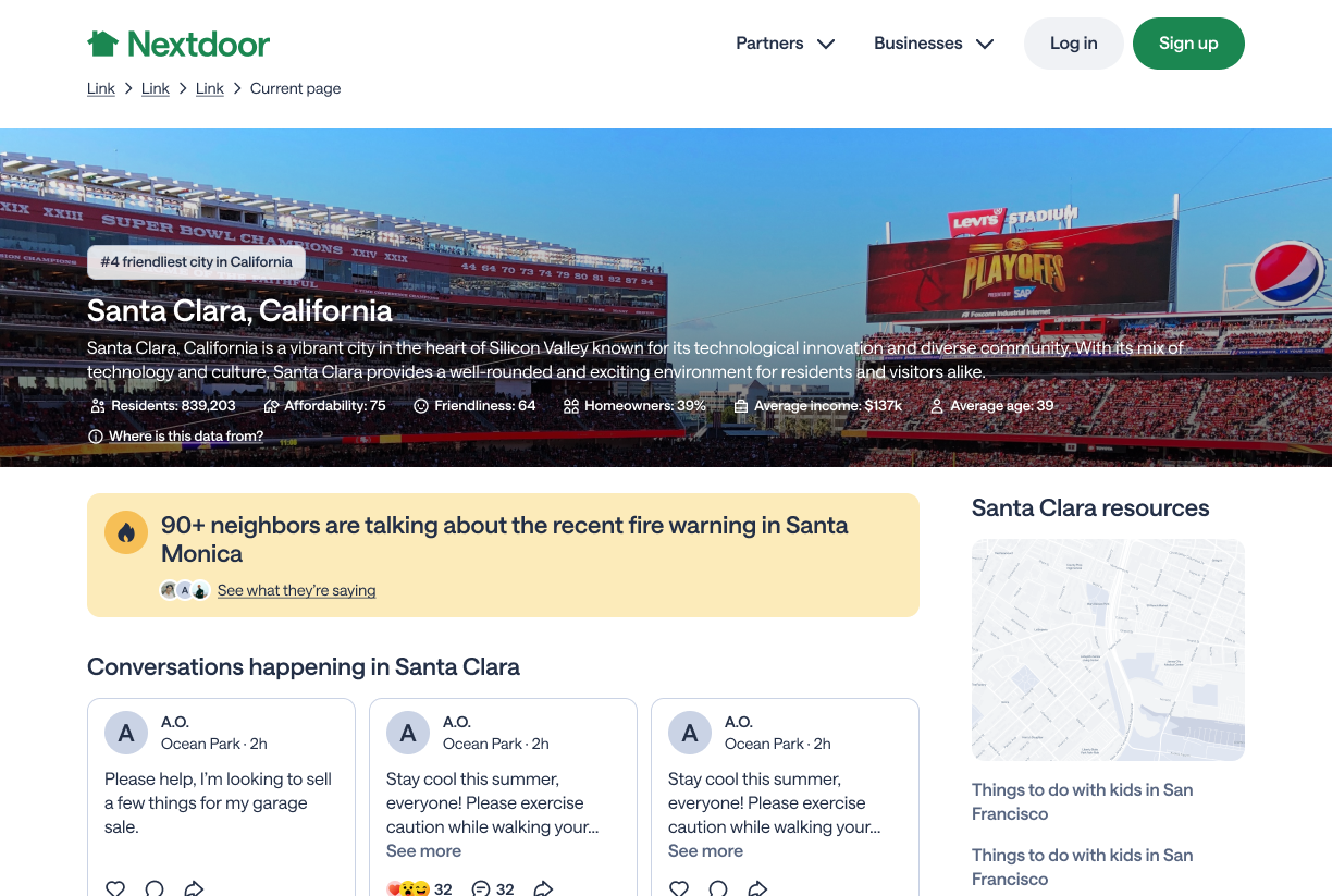
A banner showing the active alert for the neighborhood the user landed on, with specific copy, real event, direct CTA. It felt credible because it was real.
How we aligned
I presented to my PM, Senior Product Designer, Growth Design team, and Engineering Manager. Early pushback focused on which direction would best serve SEO goals. We aligned on the contextual alert because it paired keyword-rich content with genuine local value that only Nextdoor could provide.
When someone arrives on a neighborhood page from search, they see the active weather alert for that neighborhood. The neighborhood name and alert type update dynamically based on which page they are on.
This meant designing a system, not just a component. The banner needed to hold up across every combination of neighborhood name and alert type, at any text length, on any screen size. Below are three examples of what it looks like across different neighborhoods and events.
We tested two distinct copy approaches. The original leaned on social proof, showing how many neighbors were already talking. The final version led with the event itself. It won because it answered the question the user came with from search, rather than prompting them with social curiosity.
"90+ neighbors are talking about the recent fire warning in Santa Monica"
See what they're sayingLed with social proof. Underperformed in testing.
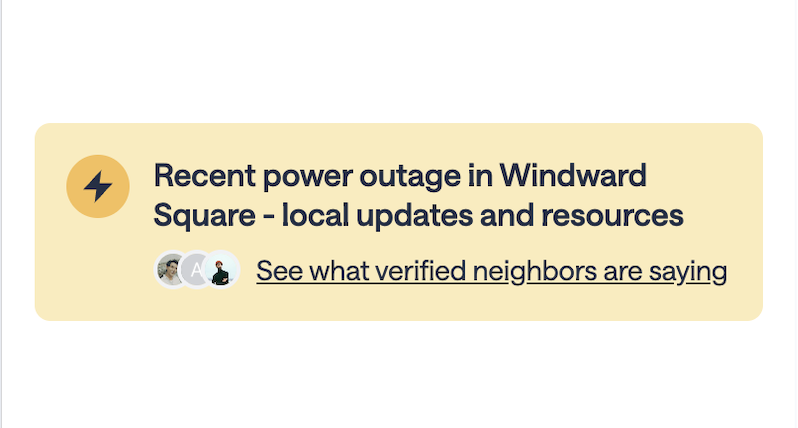
"Recent power outage in Windward Square - local updates and resources"
See what verified neighbors are sayingLed with the event. Matched search intent. Won.
The final design is a warm yellow banner below the neighborhood content with an orange lightning bolt, a bold alert headline, and a CTA with real neighbor avatar photos. The banner is always present when there is an active weather alert for that neighborhood. There is no dismiss.
The avatar stack next to the CTA is a subtle but important trust signal. It shows a non-member that real, verified people in that neighborhood are actively talking. It is proof rather than a promise.
During the engineering handoff the banner started at 4 lines on mobile, which was taking up too much viewport space. We compressed it to 3 lines, and the tighter constraint made the design work harder with less.
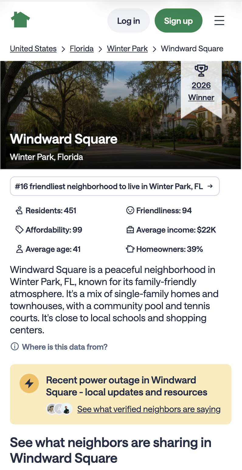
We tested on both neighborhood and city-level SEO pages. On neighborhood pages the local specificity of the content matched the specificity of the page and it showed in the results. City pages came back neutral. The team made the call to ramp neighborhood pages and deramp city pages. Ship what works and understand what does not.
Non-members arriving from Google search saw the banner, recognized that Nextdoor had exactly what they came for, and signed up. The banner closed the gap between search intent and product value in a single component on the page.
The winning copy led with the event, not the social proof."Recent power outage in Windward Square" matched the search intent of someone who had just Googled that outage. The banner felt like an answer, not an ad.
I leaned heavily on exploration over research. Earlier qualitative work on what non-members needed to see might have gotten us to the right direction faster and with more confidence going into testing.
I wanted the icon to change based on alert type, a storm icon for weather, a flame for fire warning. We scoped it to one standard icon due to technical constraints. I would push for that system earlier in the project next time.
The banner shipped with a positive result and the team moved on. A positive result is exactly when there is more signal worth chasing. I would want to run a second iteration to explore what else could be improved.
The neutral result on city pages was a data point worth understanding better rather than just deramping. There may have been a different design approach worth testing for that surface and context.