✓ Shipped
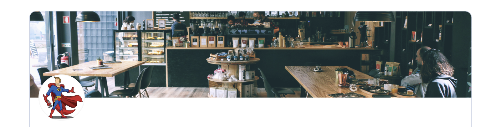
Banner Image
Restored the business banner image that had been removed in the redesign. Competitors across all four industries used images as a primary trust and engagement signal. We brought it back.
+2%
Good visits
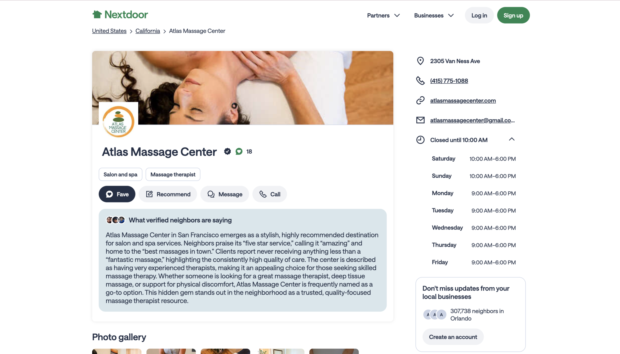
Nextdoor's business, neighborhood, and city SEO pages had taken a significant hit to registrations and good visits after a platform-wide redesign was rolled out. The visual direction of the redesign was the right call. But something in the execution had cost us users.
The challenge was not to revert the redesign. It was to diagnose what was missing, bring it back, and recover the metrics while keeping the new visual foundation intact.
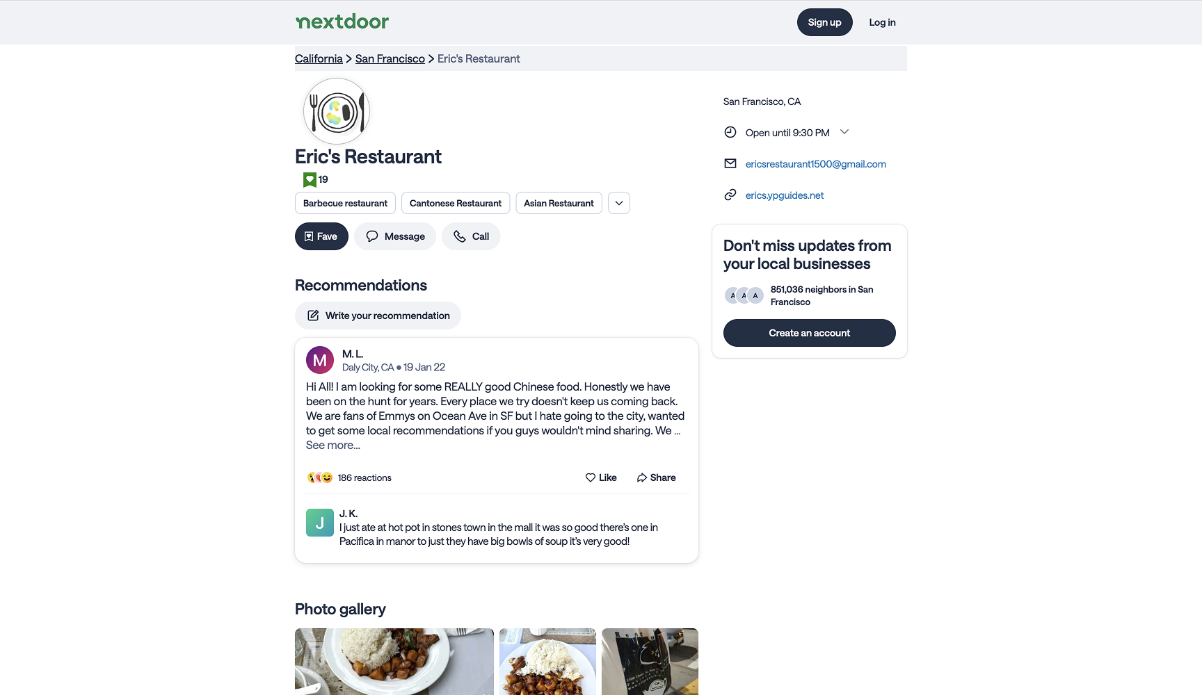
Before designing anything I did a competitive analysis across four industries to understand what users expect when they land on a business page from search. The pattern was consistent across every category: full business details, images, and clear hierarchy. Nextdoor's redesigned pages had lost all three.
Full business data surfaced immediately. Hours, location, contact, images all visible without interaction.
Rich photo galleries and complete listing details as the primary conversion tool. Images first, always.
Hours and location are above the fold. Every piece of operational info visible before the user has to scroll.
Business info density is high by design. Users expect to evaluate a business completely from a single page.
"The native Nextdoor experience had all of this data. The old SEO pages had most of it. The redesign had removed it without realizing users were coming from search specifically to find it."
What was lost in the redesign
Old version had
Redesigned version added back
I redesigned the top module of the business page and ran four separate 50/50 A/B tests simultaneously, each targeting a specific gap identified in the diagnosis. I also reverted some mobile UI changes that I believed were contributing to the steeper drop on mobile, which the data from my PM and Engineering Manager confirmed.
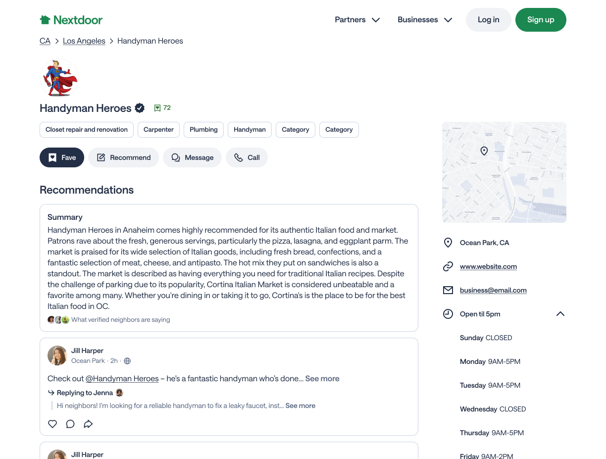
Restored the business banner image that had been removed in the redesign. Competitors across all four industries used images as a primary trust and engagement signal. We brought it back.
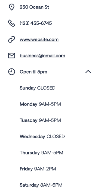
Pulled the full business data that existed in the native experience including address, phone, email, website, and open times and surfaced it on the SEO page. The data was already there. It just was not being shown.
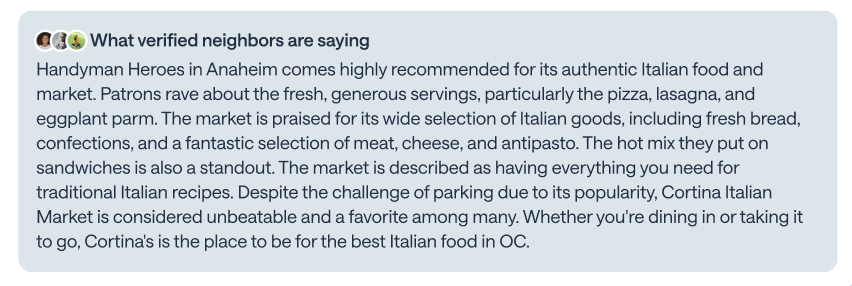
Expanded the business recommendation summaries and added a background color treatment to bring attention to them. The color made the section feel like a distinct, scannable block rather than body copy.

Designed non-sticky tabs to help users navigate a long page. The experiment came back neutral. I recommended deramping after identifying that a broken scroll interaction was skewing the result.
The final design restored what had been lost while keeping the new visual direction. Full business info in the right rail, banner image at the top, expanded summaries with a background color treatment, and a redesigned top module card that made the business identity clearer at a glance.
None of the data being surfaced was new. It was already in the native Nextdoor experience. The work was recognizing what users needed, finding it in the system, and putting it where they could see it.
Mobile consideration
Data from the PM and Engineering Manager showed mobile was taking a steeper drop than desktop. I reverted several mobile UI changes from the redesign that I believed were contributing to that gap. The mobile experience was a separate design consideration within the same project.
Three of the four experiments shipped with positive results. The biggest mover was restoring full business info, a 10% lift in visit duration from data that was sitting in the native experience unused on the SEO page.
Cutting the inline tabs experiment was the right call. A neutral result with a broken interaction is not a reason to keep shipping. I made that recommendation to my PM directly.
The redesign had not created new problems. It had removed things that were already working. The diagnostic work, not the design work, was what drove the recovery. Understanding what was missing before reaching for Figma made every decision sharper.
The competitive analysis was valuable but it was still me making assumptions about what users wanted. Direct user research on what they came to the page looking for would have made the recommendations even sharper.
I had a sense the inline tabs interaction would be complex before we shipped the experiment. The data confirmed it. Next time I would advocate for resolving the core interaction question before running the test rather than using the test to answer it.
The data existed natively but never made it to the SEO pages. A parity audit at the start of any platform redesign would catch that kind of gap before it ships and causes a metric drop.
The idea was right. Navigation within a long page is a real user need. The execution needed sticky tabs to work. I would want to come back to this with a better interaction model and test it properly.