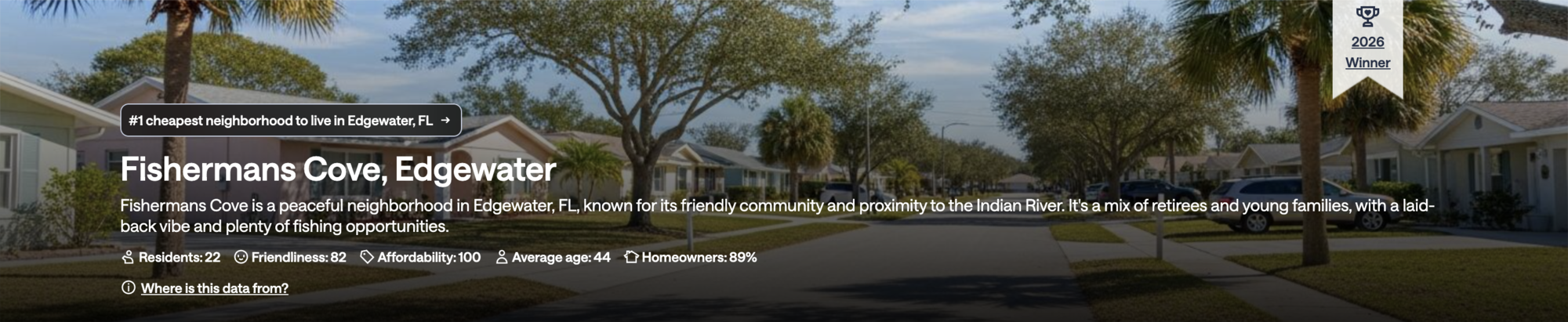
The team noticed a competitor using an award ribbon badge on their top-ranked location pages. The hypothesis was straightforward: if a city or neighborhood has earned a recognition, showing that on the SEO page might give users a reason to stay and explore.
This was not a deeply researched initiative. It was a fast, focused experiment. The question was simple enough to answer with a 50/50 test rather than a full discovery process.
Award ribbons on top-ranked pages as a trust and quality signal for users evaluating a location.
A badge for cities and neighborhoods that have earned a top ranking in a given year. Dynamic year, consistent placement.
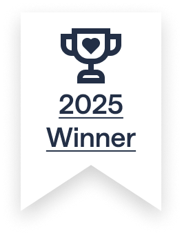
The badge as it appears on qualifying city and neighborhood pages. The year updates dynamically based on when the award was earned.
The exploration was always centered on a badge format. The question was what shape, size, and visual treatment would feel like a genuine credential without being intrusive. The final ribbon shape was the clearest read as an award at a glance.
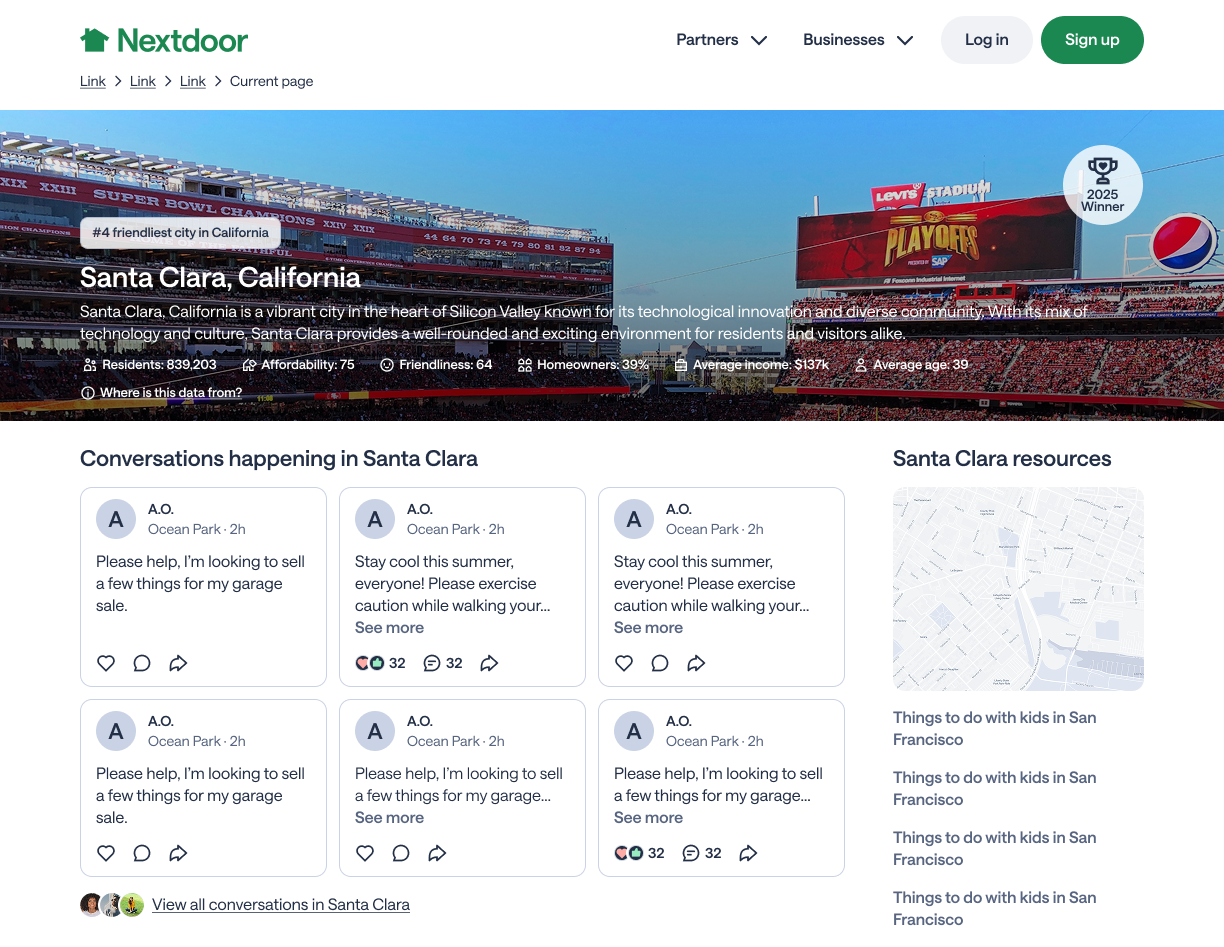
A round badge format. Felt more like a rating indicator than an award. Did not carry the same sense of recognition.
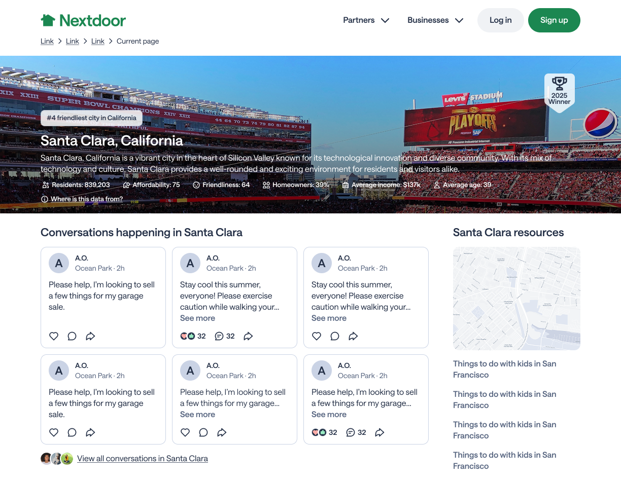
A flat rectangular label. Cleaner but too similar to a tag or filter. Lost the award feeling that makes social proof signals work.
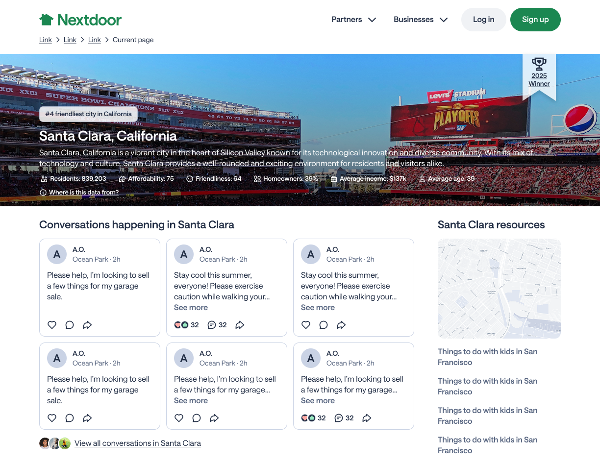
Immediately readable as an award. The ribbon shape carries a cultural meaning that the other formats did not. Small enough to sit quietly in the corner without competing with the page.
The badge shows on city and neighborhood pages where that location has achieved a top ranking for the year. The year updates dynamically so a page with a 2024 award shows 2024, and a 2025 award shows 2025.
The visual design is intentionally restrained. Light grey background, trophy icon, year and "Winner" label. No color, no animation. The restraint is the point. It signals credibility without feeling promotional.
The shipped ribbon badge is small, neutral, and always tied to a real award. It gives non-members scanning a city or neighborhood page a quick signal that this place has been recognized, without pulling focus from the content they came to see.
Placement stayed in the hero corner throughout the experiment. The badge reads as an award at a glance and stays out of the way of the primary page story.
A 1% lift in good visits from a low-effort surface experiment is a positive result. The hypothesis was right. Users respond to social proof signals even when they are small and restrained. The badge added credibility without adding friction.
This kind of experiment is worth running. Not every project needs to be a full discovery cycle. Sometimes the right move is to form a clear hypothesis, build something focused, test it, and ship it if it works.
Live in production right now. You can see this badge on qualifying Nextdoor city and neighborhood pages today.
We landed on the corner placement early and did not push much further. I would want to test whether a different position on the page, closer to the stats, would give us a stronger lift.
A 1% lift is a signal worth chasing further. I would have pushed to run a second experiment exploring whether more prominent treatment could drive a larger result, or whether the restraint is actually what makes it work.